Microsoft is currently developing Windows Mobile 7, the first revolutionary change to its mobile device operating system. Recently, I was given a document by a source inside Microsoft that details the touch and gesture plans for Mobile 7. This document is a confidential internal use only document, used to explain the plans for Mobile 7, and contains well over a hundred pages of designs, ideas, and changes to the way we interact with our mobile devices.
Below, you’ll find over 3,000 words detailing my notes from the document. I can’t publish the document here, at least not until after the product is announced, to protect my sources. I will provide the document to trusted journalists in order to share and show proof of this information. If there is anything I leave out, please don’t hesitate to ask and I will try to provide a screenshot or answer.
The document appears to be from the past summer, and some of the details may change before the product is announced. However, the touch and gesture plans appear to be set in stone, and will be the focus of Windows Mobile 7.
What’s New
 Windows Mobile 7 will dramatically change the way we use mobile devices. It will emphasize the use of touch on the device, as well as motion gestures created by using the device. It is, absolutely, Microsoft’s effort to beat back the iPhone, and the iPhone is referenced several times in the document.
Windows Mobile 7 will use touch gestures, similar to how the iPhone does. You will be able to flick through lists, pan, swipe sideway, draw on the screen. A lot of emphasis has been put on making navigation easier and doing away with scrollbars, including a new scroll handle that allows for multiple ways of finding items extremely fast.
Windows Mobile 7 will use motion gestures, something the iPhone does not. It will not use an intricate and complicated series of gyroscopes and accelerometers. Instead, it will use the camera on the phone to detect motions and create appropriate actions. You will be able to shake, twist and otherwise manipulate the phone and get things done. The phone will be able to perform actions when placed face down on a surface, and it will know when it is in your pocket or bag.
Windows Mobile 7 will have an exciting locking screen, that will allow you to play around with it, draw on it, shake it and completely otherwise mess with it.
Windows Mobile 7 will have dramatically improved visuals, different from the iPhone and much more similar to the dark and futuristic visuals of Windows Vista. It will feature graphical transitions, subtle effects, and other things to make it more interesting to look at. This is not detailed in the document, but featured in the multitude of screenshots.
Windows Mobile 7 is designed to use the finger, not the stylus, though many devices will be required to include a stylus. It is designed to be easy to use with the hand, including one-handed, and to be fun to use and easy to understand. It is designed to be used on devices with no buttons, few buttons, lots of buttons, full keyboards, and devices without touch screens.
Windows Mobile 7 is clearly designed for better media playback, with screenshots indicating a much-improved Media Player and photo gallery application. There is talk in the document of a games mode. Mobile Internet Explorer runs full-screen web pages in a minimalistic interface, and has “tabbed” browsing, except you can switch tabs by shaking the phone.
The keyboard has been improved, but plans for a full touch keyboard, a la the iPhone, have been shelved until a future version of Windows Mobile.
Below are my detailed notes. Some of it is raw, some of it is very detailed. It is accompanied by screenshots direct from the document which show off other features planned for Windows Mobile 7.
Click on any image to view it full-size. They’re all high quality images.
Goals of the New User Interface
Touch, gestures, scrolling, and direct manipulation. Also, animations, transitions, motion gestures, and codenames “Phosphur” and “Starburst”.
Goal: Finger optimized, best in class touch experience that users are comfortable with everywhere.
Requirements: simple, memorable and fun; consistent, predictable and interesting; natural movements, natural animations and transitions; and enhance the mobile experience, not degrade it.
Goal is to support hardware with buttons, hardware with buttons and touch screens, and touch screen-only devices. The Touch-only devices are specifically referenced as “iPhone compete”.
User experience requirements: consistent UI interaction across the device (up and down should always scroll up and down lists, not something else), should not be overloaded. The new UI will not be opt-in for applications, but required, so old applications will all get it. There will be a “game mode”, where games will be allowed to override the UI requirements and use similar movements for different actions, allowing games to have more complicated controls than the average app.
There will be audio and visual feedback, only where appropriate, like indicating the top and bottom of a list, which objects are touchable, and a “ring of fire” indicating where you press and hold down your finger.
Designed to be used by a finger, without a stylus. Microsoft Research is researching the size of the average fingertip/tap size. Currently, they are working with the assumption of a 7.6×7.6 millimeter fingertip size. The goal is a device that can be used almost entirely one-handed with the thumb of the hand holding the device.
There were plans to implement the Soft Input Panel (the on-screen keyboard) as a finger accessible portion of the UI (like the iPhone does), but it was cut for Windows Mobile 7.
Tap drills down in a list, but some lists will have you tab once to select, once again to drill down the list.
Interface elements will be designed so there is no fear of users making a mistake and missing their target. It will be able to dynamically resize elements of the user interface, prioritizing them and making them easier to hit. Corners, like the close button, scrollbars, icons and the title bar/status bar, will all be able to grow to make things easier on the user.
A stylus will be required on devices meeting certain screen size, orientation, DPI and resolution marks. User interface elements will scale their size and be prioritized in order to make hitting them easier, especially scrollbars, corner elements, icons, the title bar and the status bar.
Touch may be the actual product name as it stands.
Gestures for scrolling (horizontal and vertical), task and menu access, press and hold controls, list items, press and drag, and launching shortcuts. The device will be able to detect finger velocity, scrolling further if the user’s finger moves faster.
They are considering the need for scroll bars when users are scrolling with gestures. Current plan is to show them on Touch devices when flicking through a list, but not show them on button-only devices when scrolling.
When a dialog is longer than the screen and needs to be scrolled horizontally, they are considering replacing the scroll bar with a visual indicator, like text fading off the edge of the screen.
Pressing and holding launched the context (right-click) menu, as it does now.
By default in a list, tapping drills down items, but there will be visual and audio feedback if drilling doesn’t occur and the user is merely focusing on an item.
A stylus will be required for device makers to include, based on screen size, screen orientation, and screen resolution.
Microsoft is considering if it needs to support screens and drivers that do multi-touch, but multi-touch is not a base feature of Windows Mobile 7. Multi-finger touch is shown for cropping and rotating photos, but there is no indication if this is software based or requires multi-touch hardware.
Motion Gestures
There will be various finger motion gestures, used for scrolling vertically and horizontally, task and menu access, pressing and holding on controls, list items, pressing and dragging, and launching shortcuts.
Some UI elements, called Spinner and Pivot, will have a gesture where you swipe them from left to right. In a Spinner, you have a single item with left and right buttons next to it, but instead of hitting the left and right buttons, you can just swipe to change the option.
There will also be motion gestures, where the user moves the device to invoke certain commands. Microsoft Research has a technology concept that uses the device’s camera as a motion sensor, enabling motion control while using the device. This means devices will not need accelerometers and other complicated gyroscopes to get these features, and that existing Windows Mobile devices could be upgraded to full Windows Mobile 7 functionality. These gestures will require the camera to be operating all the time a gesture may be used, which will affect battery life.
There would need to be support for gestures when the device is locked, including slider control, which hints at a similar locking mechanism to the iPhone. It will also support changing screen orientation when turning the device sideways, just like the iPhone does, but using the camera, not a gyroscope.
Windows Mobile 8 will support gestures in the auxiliary screen. Windows Mobile 7 will not.
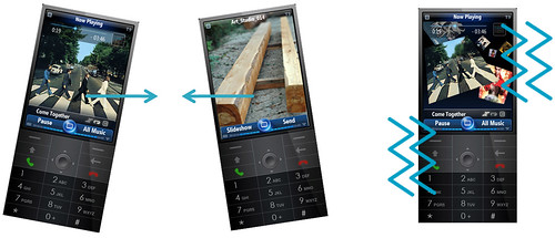
Gestures shown include in music or a slideshow, shaking the phone left or right to go to the previous or next song or photo, and shaking the phone in order to shuffle it. Here’s an image, which may only be a mockup, or it is showing us what Windows Media Player will look like on Windows Mobile 7, as well as the picture viewer:

As you see, Media Player has an emphasis on album art along with other cool visual elements. Also notice the ever-present battery and signal strength indicators have been placed inside the soft key buttons at the bottom of the screen, saving screen real estate and making them a lot cooler.
Another gesture: When pressing the directional pad down in a full-screen media application, such as a photo application, you can move the device forward and backward to zoom in and out of the image.
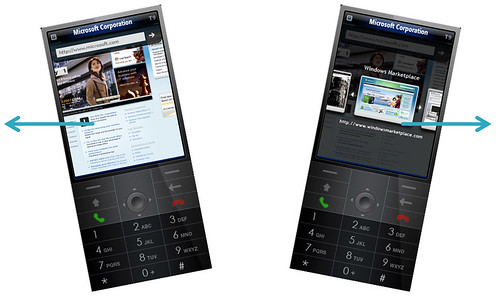
The web browser will incorporate gestures for back and forward actions. Here’s an image:

Notice the differences in Internet Explorer. The interface is simpler and much nicer, with just an address bar and go button, the web page is a desktop version, just like on the iPhone, and the browser has tabbed browsing, used by gesturing through a series of graphical thumbnails. This is very impressive.
The camera will also cause certain actions based on light sensitivity. For example, if you put your phone in your pocket or in a bag, it will shut off the screen, and can even make the ringer louder or put it on vibrate, as directed. It can also turn the screen on automatically when taking the phone out, trigger the timer on the phone’s camera when the phone is placed face down on a surface, automatically activate the camera flash based on available light, snooze the phone’s alarm when waving your hand over the phone’s camera, taking a picture when anyone walks past the phone (or any other desired action, like making a noise), or remotely connecting to other devices when the phone sees them.
Waking Up and the Lock Screen
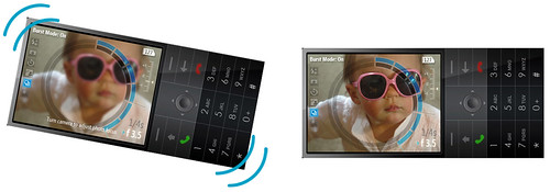
Here’s an example of a gesture, shaking the phone to wake it up:

The document says that gestures should be distinct, convenient, easy to use, and they should also be fun and have feedback that responds to the user’s action. They shouldn’t be hard motion, but simple jiggles or shakes, with the screen reacting to the amount of shaking, the number of shakes, that sort of thing.
An example of the screen showing a transition from the device being asleep to awake:

As you see, it’s a very nice and detailed, but subtle graphical transition. Microsoft never cared about transitions before, but it looks like Windows Mobile 7 will be different.
There’s also a part talking about allowing the user to “doodle” on the screen (their word, not mine), letting users draw doodles on the device lock screen, as well as shake the screen to affect the wallpaper (like making water run, or blurring an image). The iPhone’s lock screen is an iconic part of the device, and Microsoft wants to have a cool lock screen without copying Apple, so the plan is to give you fun things to do on the lock screen.
Here’s an image showing the user doodling. Notice the use of two fingers, hinting at software-based simple multi-touch, or perhaps the image assumes the device has multi-touch hardware?

And a screen that has been shook or doodled on:

That makes for a pretty cool locked phone.
Touch Scrolling/Flicking
Users will be able to flick their way through lists and swipe sideways for certain actions and pivoting views. When scrolling through lists, letters are shown to indicate as the user makes his way through the alphabet, as well as the addition of a scroll bar. There will be a visual bump when reaching the end of a list.
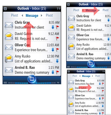
Besides flicking up and down, the user will be able to pivot sideways between different hotlists. The user can swipe to pivot between each, tap a selection in the pivot wheel, or hit an arrow to launch a pivot selector for all available pivots.
An example of pivoting in the Recent Programs menu:

Here’s a screenshot of Outlook’s inbox:

Also shown is flicking and swiping through an unnamed maps application, based on Windows Live Maps, and flicking based on the velocity of the user’s finger. Other types of finger gestures include the use of spinners and sliders, and unrestricted omni-directional movement.
A screenshot of panning in the maps application:

Those arrows on the sides of the screen are shown as being used in all applications, including IE Mobile, to let the user know when they are panning the screen.
When hitting buttons/icons on the screen, the UI will try to prioritize items and determine which one the user wanted to hit, so users who are sloppy with their fingers will still get the desired result. It will use this smart targeting when using your finger, but not when using the stylus, a very smart design decision.
When using the keyboard, the letter enlarges and appears above your finger when you hit it, just like on the iPhone. When highlighting text, a zoom/edit box appears above it to show what you are highlighting. When in full page view in IE Mobile, if you hit an area with links it will zoom in with a bubble and help you choose from the links. Observe:

Notice Word Mobile. It has the Office 2007 Ribbon, but it appears to be lifted directly from Word 2007 and far too small to be used on a mobile device. Assume that this was put in for the mockup, and not an actual application screenshot, but also assume that they are going in the direction of a Ribbon-based user interface for Office Mobile.
There is handwriting recognition listed for OneNote Mobile.
An example of a context menu, activated by pressing and holding in an area (like right-clicking on a PC):

Other examples of what Microsoft calls Press N Hold UI elements include an application launcher and a quick scroller (for quickly moving through a list with a scrollbar and the first letter of list items):

Currently, when scrolling down a screen with the directional pad, the selector moves to the bottom of the screen, then scrolls downward one item at a time. In Windows Mobile 7, the list scrolls upwards as the selector moves downwards, acting in sync so that the selector does not reach the bottom of the screen until it reaches the end of the list. This gives the user feedback on how long the list is and where the user currently is within the list.
When the user flicks to scroll within a list, a scroll handle will appear on the side. If the user touches it, the user can drag the scroll handle up and down for faster scrolling. This replaces the scroll bar. The more the handle is moved, the faster the screen will scroll. A screenshot:

Scroll bars in Windows Mobile 7 will never be part of the screen, but rather floating transparent visual elements on top of it. They will only be used when necessary.
A filmstrip view is shown, with the music filmstrip clearly showing a Zune icon with the option to purchase the song:

There are many pages showing other UI elements, including radio buttons, Spinners, sliders, text entry boxes, combo boxes, drop down menus and such, that I have left out. If anyone desperately wants to see them, let me know and I can add screenshots.
There’s a list of gestures that are being explorer and may or may not make it into Mobile 7, including a gesture to dismiss an on-screen notification by shaking it off the screen, a gesture to automatically take you to a Smart Search notification panel, turning the phone like turning a key to unlock it, Pivoting by gesturing the phone sideways, moving through lists by shaking the phone up or down, switching the camera into black and white or other modes by shaking it down, adjusting camera aperture and shutter speed by rotating the camera, sending a file by “tossing” it to another device.
I left out most of these, but if there are any more you want to see, just let me know and I will try to accommodate. Here’s the camera gesture, just because the UI is so cool:

There’s a list of list view options that are likely cut, including expandable/collapsible headers in grid view (I also didn’t cover grid view), a carousel view (sort of like a vertical pivot), scrolling one item at a time with touch, accelerometer gestures.
Windows Mobile 7 will ship in 2009, according to the document. This makes sense with the Mobile 6.1 point release that is coming around now. Hopefully, Bill Gates will announce Windows Mobile 7 at CES tonight, but if not, you now have advance notice of what is coming next year. Microsoft clearly has a lot planned to make Windows Mobile 7 the revolution it needs to be to compete with Apple, and Mobile 7 is going to bring some cool and excitement to Microsoft’s smart phones.


